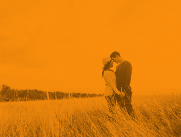
How to Choose Your Wedding Color Scheme
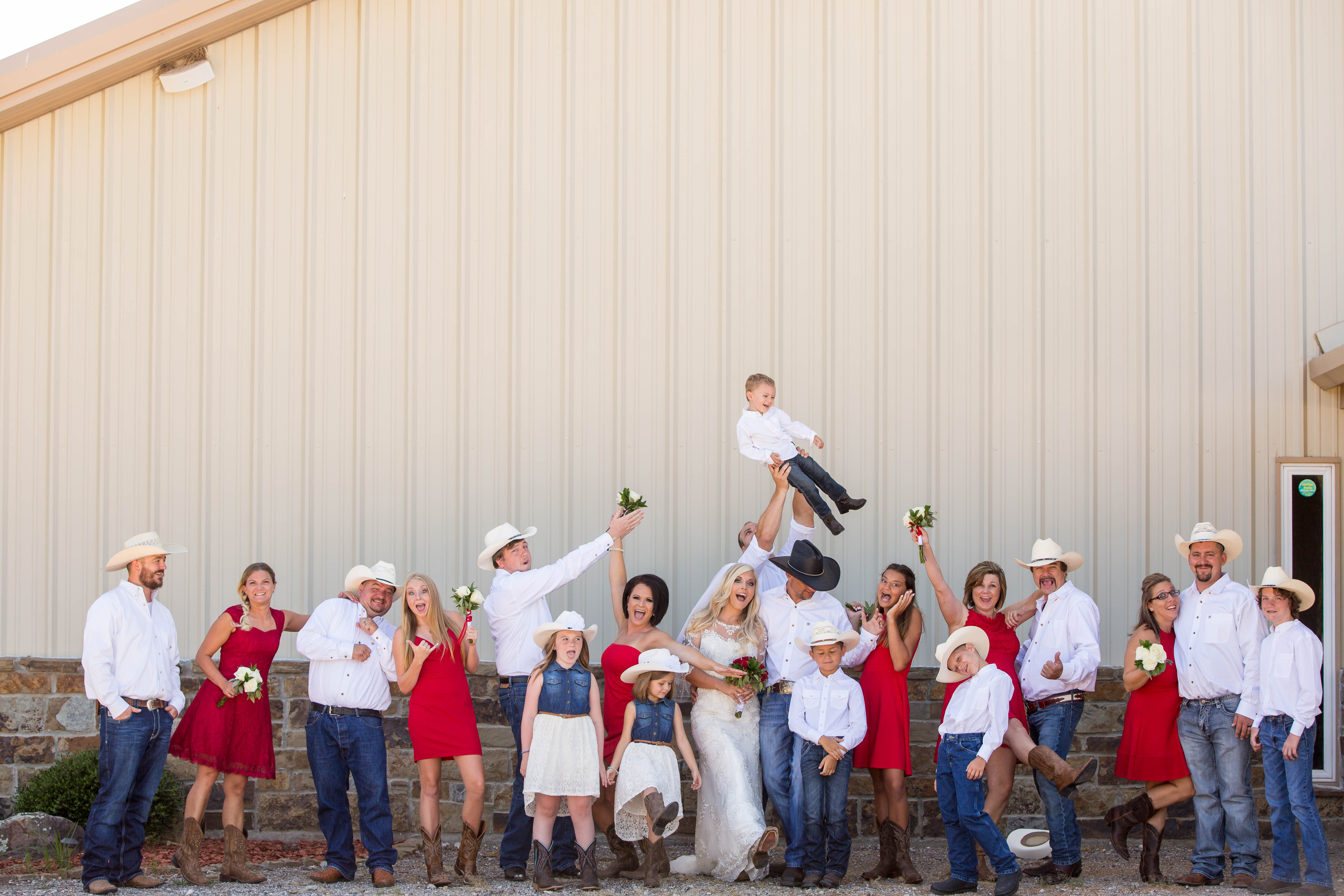
When it comes to setting the tone for your wedding, there is almost nothing more important than the wedding color palette itself. Whether you are set to wed when it’s chilly and are looking into winter colors or have your eye on something a little warmer and brighter with spring colors, the tonal theme is a very conscious choice to make. Breaking it down step by step, then, can be a great place to start.
Go About It Seasonally
Sure, you may adore an icy blue, but if you have a June wedding, then that’s not really the best fit for a summer color palette is it? Take into consideration the time of year of your wedding and plan seasonal colors appropriately.
If you’re getting married in the heat of summer, embrace warm, bright tones – you know, hues of flowers, the brightness of sunshine: summer wedding colors. If you’re going to walk down the aisle come October, a richer, more appropriate to fall color palette, ripe with burgundies and moss greens and burnt oranges may be best.
Let Your Setting Speak to You
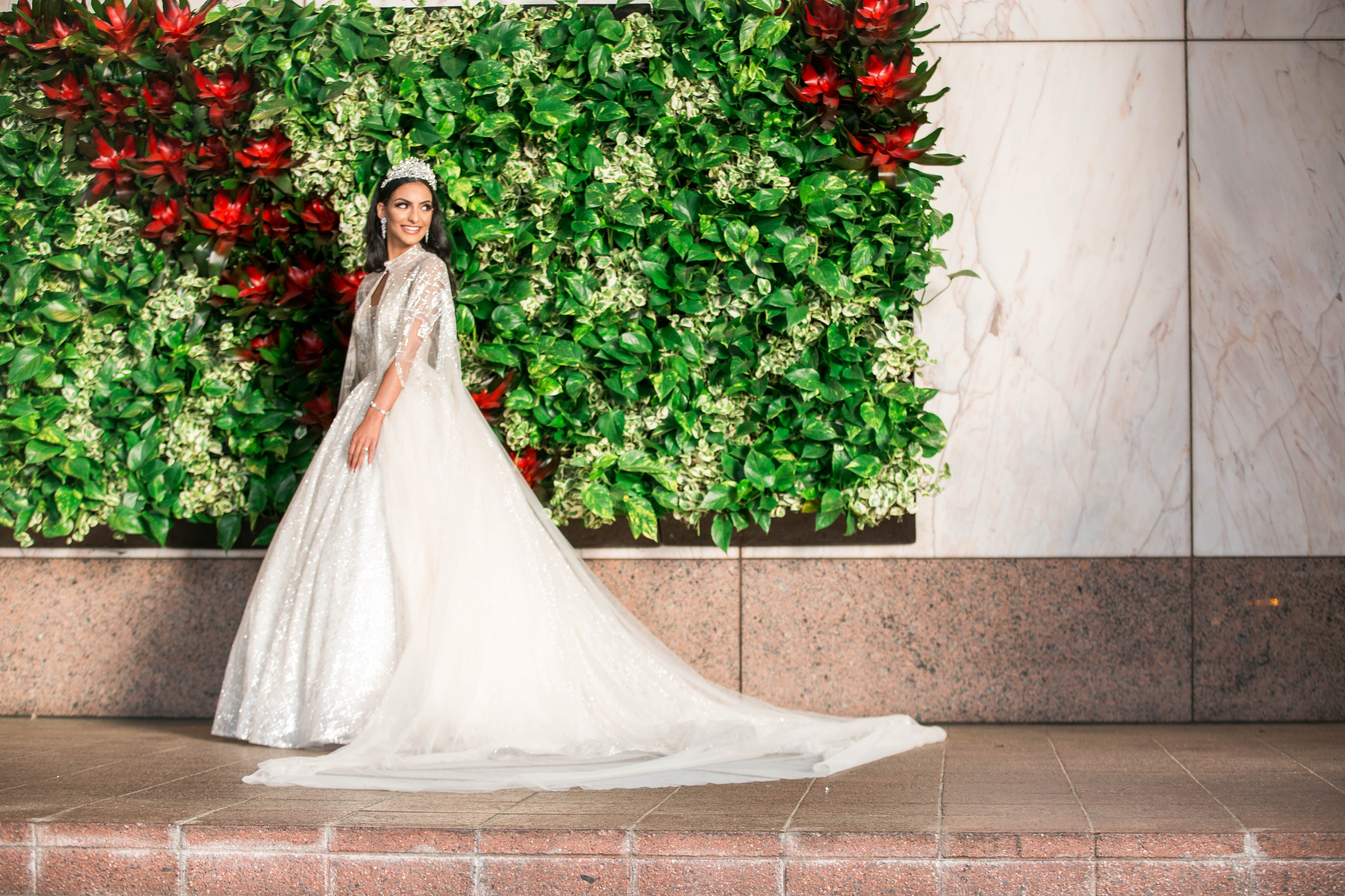
Chances are you will already have a venue picked out even before you start dreaming in technicolor. And as they say in the real estate biz: Its location, location, location. So, once you have that ultimate setting tied down, allow it to speak to you and influence you. Is your venue seaside?
Feel free to be inspired by beachy tones of blues, greens, and coral. Have you booked a grand ballroom? Perhaps something richer and more fitting for sparking up an enclosed space.
Mix & Match By the Rules
Sure, we all want the rules not entirely to apply to us, but there are some solid foundations of color clashing that will always be at works. Opposites pair well together (i.e., if you are looking for fall wedding colors that are sure to compliment, an orange similar to autumn leaves paired with a rich, velvety blue will always work because they are opposites on the color wheel).
Neighboring colors, too, will still look good together – buttery yellow and soft orange, for example, lay right next to each other and so naturally complement each other’s shade.
Make Sure We Out Here Vibin’
Your colors will set the tone and create a mood, so make sure they are putting out the right energy. If you want a sea of tranquility, stick to pastels. If you want an elegant atmosphere, rich, jewel tones will be your friend.
Trust Your Color Gut
At the end of the day, it is your wedding, and it is a reflection of you, so make sure you are choosing colors you actually like. If you adore blue but have an aversion to reds, don’t feel obligated to deck your wedding party out in a sea of cherry. You are going to want to feel comfortable and also to look back on your pictures and smile.
BACK TO ALL BLOGSAbout Author
Recent Blog Posts
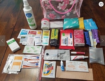
Wedding Emergency Kits: What You Need In Yours
No bride wants to be Bridezilla. But bride freak-out is a real possibility — even if you’re the most easy-going, relaxed woman you know. The fact is that your wedding day is going to be absolute chaos — and it’s not about panicking that this is your “last day of singledom.” It’s about the reality […]
READ MORE
How to Create a Stunning Wedding Website (and Hashtag!)
Go to almost any wedding these days – or browse any recently married friend’s Instagram – and you’ll see it: the cute, catchy, unique wedding hashtag. Almost every couple has one for their big day, now, and it’s easy to see why: pictures are organized across social media and easily searchable for the bride, the […]
READ MORE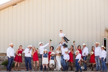
Wedding Planning Advice – Hire Vendors You Connect With
When it’s wedding planning time, be prepared to feel overwhelmed for a moment by the fact you need a wedding vendor for EVERYTHING: a cake, a caterer, a wedding photographer… Yup, it’s a lot of people! And while you begin to thumb through your options, keep in mind one thing: that personal connection is gonna […]
READ MORE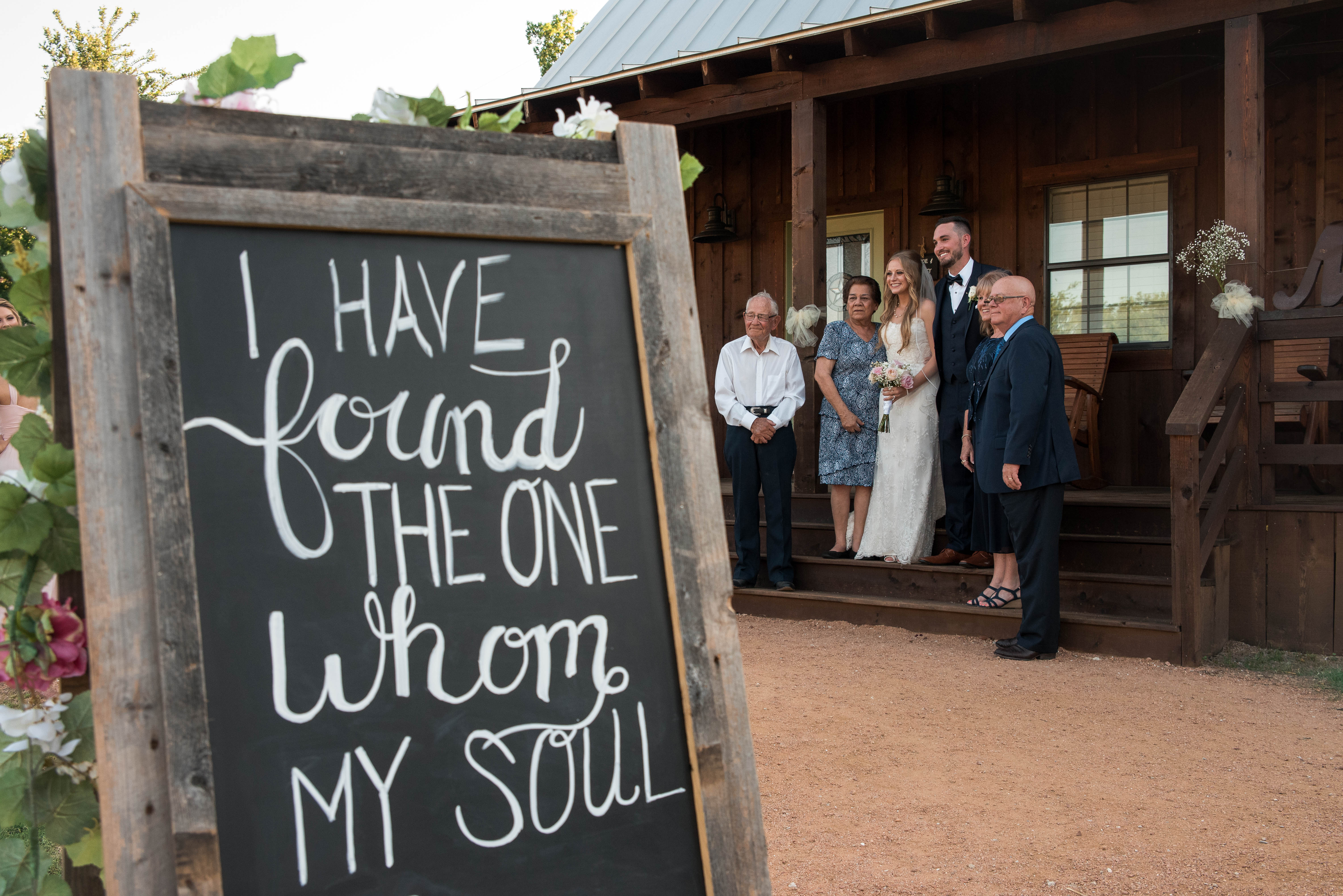
The Tech Savvy Bride – How to Plan and Find Vendors Online
Welcome to 2019 – if you’re not planning the majority of your life online, you’re not only missing out on your best options, you’re also a pretty rare species. And when it comes to wedding planning, if you want to be sure you’re getting and researching the best vendors, the only way to go is […]
READ MORE


